Food Bank Gouda Website

Client Info
The Food Bank Gouda is a Dutch charity organization that supports people who are temporarily unable to afford enough groceries to make ends meet. By collaborating with local suppliers, supermarkets, and volunteers, they provide food packages to residents of Gouda and the surrounding areas to help them return to a normal standard of living.

Client Website
The website of the Food Bank Gouda exists for users to provide them with three options: 1 User’s can donate food or money to help the food bank provide for people in need, 2 Give a variety of needed information to its users and 3 Users can make contact with the Food Bank to get help that they can’t get through the website.

My Role
I was searching for a short term (11 weeks) UX school project with my personal goal of contributing back to society, this is how I came across this local food bank charity organization and noticed the state of their website and how it could be improved. I talked with the lead members of the charity and explained some improvements that could be made and that I was willing to do this project for free to help them in their mission of helping people, they accepted my offer and the project began.
The Problem
The current version of the Food Bank Gouda website wasn’t easy or quick to use when it came to its three main functions:
Donating, Information Gathering and Making contact to ask for help.
Unprofessional & Unintuitive
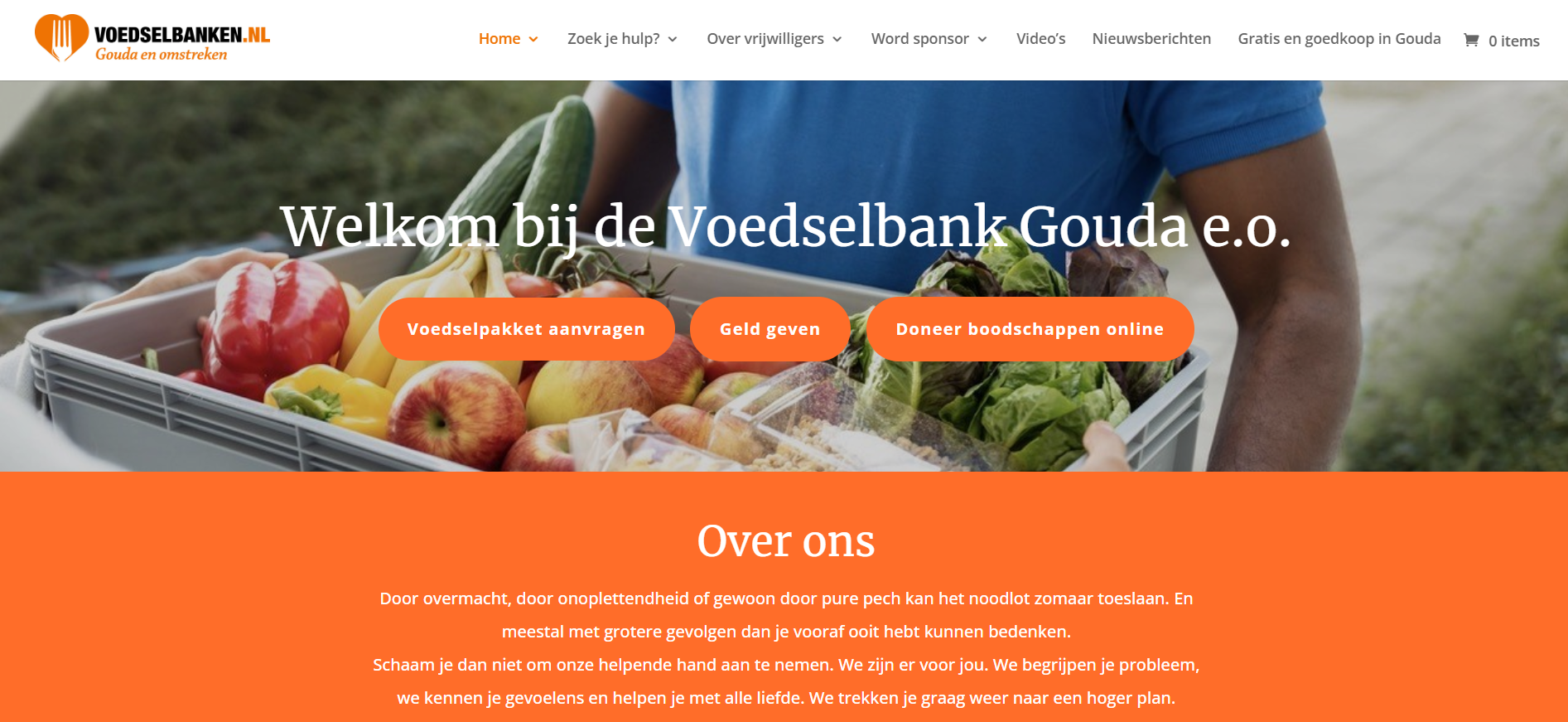
The website came across as unprofessional due to its overuse of the same three colors for nearly every element, the lack of fonts that weren’t of the Arial type and many other choices in its design that made every section indistinct and blend together. This made the site hard to use and look at for users both new and experienced.
Misleading & Missing Elements
At the beginning of the website’s homepage, the user is greeted with 3 call to actions: 1 Request food packet, 2 Give Money and 3 Donate Groceries Online. The give money call-to-action button doesn’t actually bring you to the donation page, while the Donate Groceries online call-to-action button brings you to a web store where users can donate groceries and money. This and other elements of the site were not clear in their function.
The Goal
Improve the Food Bank Gouda website so that users can easily and quickly use its three main functions: Donating, Information Gathering and Making Contact.
Quick and Intuitive
The site must be easy to use for everyone and help users achieve their goal in the quickest time possible so that they can get the help they need as quick as possible.
Professional look and feel
The website needs to look professional and clean to project confidence and safety towards it users who come to them in uncertain times.
Key Design Factors
And most important project findings
Consistency optimization

This flowchart displays the three primary tasks that a user could perform on the site and in how many steps they could be completed
This project was odd in the sense that the website itself while not in a great state still allowed most users to accomplish their goal without getting lost, so the focus for the optimization was to make the whole experience more consistent by adding missing details. Details such as a navigation link to the donation page that was missing, refining text to reduce their size whilst maintaining all essential information and finally by adding more visual clarity so that users could better distinguish site elements from one another.
Identity alignment

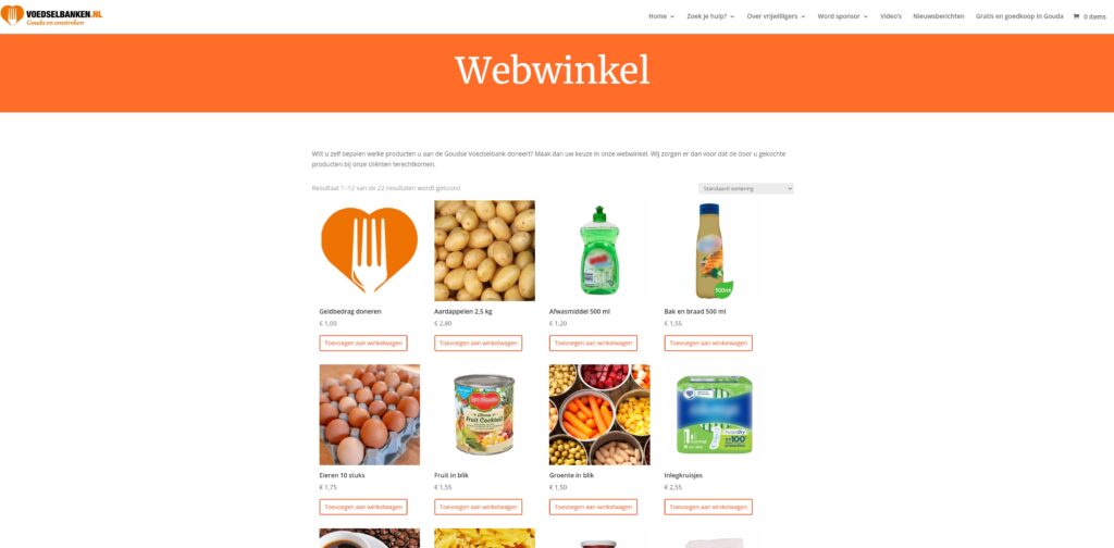
An image of the website’s webshop
Halfway through the project, I began to notice that certain elements of the website didn’t align with the organization’s mission. A very particular example was a page called the “Webshop”. The intended purpose of this page is to allow users to donate money or food. It looked very corporate for a charity, whilst being very spartan in its lack of user tools to help users search for specific donation items or to account for their donation budget.
Project Conclusion
At the end of the project, I brought value to the VoedselbankGouda by providing:
Lofi Prototype
A design dossier with all the project findings and conclusions
Insights into the shortcomings of their website
Insights about their online user needs


